Monday, September 30, 2013

Gammar Responsive Magazine Website HTML5 Template

Gammar Responsive Magazine Website HTML5 Template

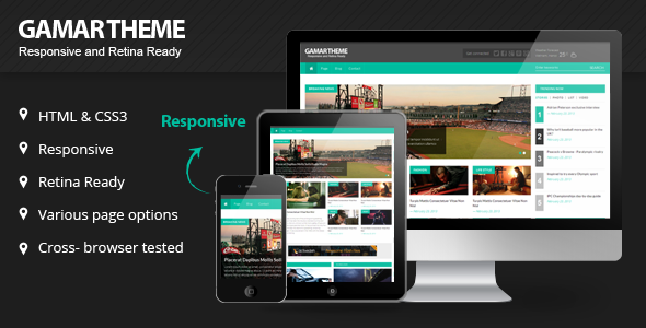
we are pleased to introduce Gamar- Great Magazine Website Template!

Theme was designed and coded by: kopatheme.com

Fully responsive , It is a great magazine website template because they give your website a professional design with a constant look and feel on all devices. It doesn’t matter if a user is viewing your website on a desktop, tablet, smart phone or any other mobile device.

Using some of the most popular current design trends as HTML5, CSS3 and jQuery, it is unique in it design and can be customized easily to suit your site. We hope this great magazine website template will help get you started building an online magazine right away.

Features

  • Fully Responsive
  • Built with Boostrap and retina ready
  • HTML5 and CSS3 tableless design
  • 12 Validated and well commented HTML5 Pages
  • Two diffrent style blog posts Page options
  • 5 diffrent style Single Page options
  • Contact Page with Ajax/PHP Contact form
  • A lot of shortcodes
  • A lot of widget elements
  • About page
  • Error page
  • Google Web Fonts
  • Documentation included

Support

  • Support through our support forum at http://kopatheme.com/forum
  • We are available for customize the theme if you need. Please send us your email at kopatheme@gmail.comIn working day (from Monday to Friday), all the question or problem related to our product will be responded within maximum 24 hours. No matter how long it takes, we will support you until the problem is completely fixed. Support request sent during weekends will be processed on next Monday morning.

Sources and Credits

The above demo images are copyrighted to their respective owners under Creative Commons-licensed for commercial use, adaptation, modification or building upon. The images are used for demo purpose and are NOT included with the download.

Whether you are a startup with limited resources and time or looking to give a magazine/blog look and feel to your next web project, ForceFul responsive HTML5 magazine website template got you covered!

Pav Bestbuy Responsive Opencart Theme

Pav Bestbuy Responsive Opencart Theme


Focus on simple and impressed design with the black and white color combination in harmony with the other colors. Template layout implements beautiful slideshow module, discounts, latest product blocks that will be a good solution for shop selling many products.
Pav BestBuy Responsive Opencart Theme is a specialized theme for supermarket contains product galleries or catalogs to present a huge range of products. Indeed, It delivers you all you need for Market Production Shop, Mini Mart, Fashion Store, Plaza Store website, and a brilliant shopping cart solution powered . This template is very special design with great layers slideshow having 100+ animations combines highlight carousels and nice banners giving a magnificent look and passionate feel as well for your online stores.

The Opencart theme built with Pavo Framework to make working perfect on Wide Screen, Desktop, Mobile or Tablet and offers full features, advantages of Opencart and our extensions, such as Mega Menu, Slider Layer Slideshow with 200+ Effect Transitions, Best Seller Carousel, Featured Module that you easy to setup site very beautiful & impression for Fashion Store, Hightech Store, Drinks Shop, Food store, Toys Shop or Cakes Store….

It has fours color variations, stylish look template, control over mega menus, Google fonts, over fifty modules positions and many more features.

Features

  • Compatible with Opencart 1.5.4, Opencart 1.5.5, Opencart 1.5.6, Opencart 2.0, Opencart 2.1
  • Support Wide Screen 1170px, 980px …
  • Built-in Pavo Framework and Bootstrap
  • HTML5 and CSS3 Support
  • Full Responsive Theme
  • Google Fonts
  • Integrated Mega Menu Module
  • Integrated Blog Module
  • Integrated Pav SliderLayers Module
  • Valid XHTML and CSS markup
  • Eeasy control theme such as skin changer, font-changer, modules – position … via Control Panel Module
  • Easy Use and Easy Customize As great for customwork
  • Support Add Custom Javascript, Css, Change Background …
  • [NEW]Improved Awesome Font
  • Support Multiple Layout – Position, Allow drag and drop modules
  • [New] Off Canvas Menu Support, Display Very nice on Handhelds and Easy to customize
  • [New] Support Multiple Zoom types: Basic Zoom, Inner Zoom, Lens Zoom, Gallery Slider Zoom, Basic Gallery Zoom
  • [New] Quick Popup Zoom Image In Product Listing
  • [New] Support Display Sale Label for Listing Products and Product Detail, In Module Carousel…

Explore BackEnd Demo

Explore Features Via Guide

Multiple skins

Flexible Layouts – Module

Great Layer Slider

Megamenu Support

Pav Blog Module

Support Ways

Easy to install data sample on existed store

Change Logs

  • 12 November 2015: Update quickstart + theme with opencart 2.1
  • 20 April 2015: Update quickstart with opencart 2.0.2.0
  • 16/01/2014: update quickstart with opencart version 1.5.6.1

Exoone - Corporate Business HTML Template

Exoone - Corporate Business HTML Template

Visit Our WebsiteFollow Us on ThemeForest Follow Us on TwitterFollow Us on Facebook

Exoone is a modern and flexible html template for corporate, business and company websites. This theme also good for portfolio, gallery and any kind of websites.

Main Features:

  • SEO Friendly
  • Responsive
  • Home pages
  • About Page
  • Contact Page
  • Portfolio Page
  • Blog Page
  • Single Page
  • Multi Level Dropdown Menu
  • Flex Slider
  • jQuery PrettyPhoto
  • Contact page with fully working Ajax Contact Form
  • PSDs and Documentation

Theme Support

After purchase please ask support question via our support form.

Trenton - App Starter Landing Page

Trenton - App Starter Landing Page

Whether you want to create a landing page for an app or a product, Trenton puts it into the right perspective. Trenton is slick, clean and eyecatching! Perfectly tailored to target new customers.

Brooklyn - Creative One Page Multi-Purpose Theme - Creative WordPress

Version 1.2- fixed an issue with cta buttonVersion 1.1- fixed an issue with slide-in-effect (iPad & iPhone)Version 1.0- initial version

NEXT - Unique & Easy Portfolio Responsive HTML5

NEXT - Unique & Easy Portfolio Responsive HTML5

NEXT is an award winning, easy-to-use portfolio template with Live Metro Panel, Unique Navigation (worth 4 USD), Animated Content, BG parallax, Standalone Pages and Retina Display optimization. This template includes 3 layouts in the pack

NEXT WordPress theme is also available: http://themeforest.net/item/next-wordpress-unique-easy-portfolio-/6157170

Easy to use and edit

This template is really easy to use and edit, you can add any colors to any elements or sections as we have Color Swatch Classes (Only a single line CSS editing can do it). Also the template comes with PDF user-guide having 30+ pages that covers everything in detail

New MacOSX Mavericks Tested
This template is completely tested and working perfectly on all major browsers including the latest Safari (v7.0) on MacOSX Mavericks
Key Features:
  • Very simple & easy to use creative portfolio template
  • Featuring Live Metro Panel and Flat Colors
  • 3 Layout variants are included (Please see live preview).
  • High resolution (retina display) optimized
  • Animated Elements & Content Blocks, supports more than 55 animation effects via: http://daneden.me/animate/
  • Featuring a premium navigation module (Worth USD 4)
    http://codecanyon.net/item/clean-responsive-side-menu/5266366
  • Expanding AJAX portfolio supports Image Slider, Youtube / Vimeo video, Lightbox Image, Lightbox Video etc.
  • Additional standalone pages for displaying Project Information & Personal Profile.
  • Expanding Overlay Content Panels inspired from Metro UI.
  • Stellar BG parallax layers with optimized mobile view.
  • Portfolio lightbox supports images, image gallery, video from youtube and vimeo.
  • Flickr Integrated dynamic image grid featuring live Flickr Feed
  • Twitter Integrated with latest API compatibility.
  • Perfectly responsive, mobile optimized layout powered by latest Bootstrap 3.0 (Mobile FirstFramework)
  • Manually tested on major mobile devices including iOS 7 – iPhone, iPad with Retina Display,Galaxy S3 on Android, Windows Phone.
  • Perfectly working on latest Safari (v7.0) on MacOSX 10.9 Mavericks
  • The template comes with PDF user-guide having 30+ pages that covers everything in detail
  • Dedicated Support from our great team – we are here to help you on bugs and issues within ourtemplates.
Dedicated Support:
Dear buyers, for free support on our themes please contact our developers via our Support System website: http://support.designova.net/
Update Log
Updated to v1.2 on Nov 07, 2013 :
Please find the change log here: http://designova.net/changelog/next.pdf
Image Credits:
Live preview images are from Flickr profile of Fotuwe, CubaGallery as well as Vonderauvisuals.We are not distributing these images via download pack. We have placeholder images for each instance.

Template Credits


Copyright(c) 2015 Designova, All rights reserved..
.A premium quality template from Designova

Big Junior - Multi-Purpose Responsive Theme

Big Junior - Multi-Purpose Responsive Theme

Our Latest Project


\\\\

Enjoy a world of possibilities through this wonderfully hand crafted theme. Create virtually any layout you can imagine with loads of tools that BigJunior brings to the table. Are you looking for a subtle way to showcase your talents or products? Do you like single page sites? Just looking for fresh and different blog layout? Its all there and there is lots more! We also paid special attention to social elements so you can beautifully introduce your team or company with great detail. Still here? Try the demo website and see it for yourself.


\\
\\


Features Overview:

  • Unlimited Layouts: Build nearly any layout you can imagine using our powerful shortcode generator and page options.
  • Unlimited Colors: Easily change theme color to any color you like using built-in options.
  • Mega Responsive: This theme’s layout will adapt to virtually any phone or tablet screens.
  • Retina Ready: Shines like a diamond on high resolution devices and retina ready screens.
  • Translation Ready: Ready to be translated to any language (with po/mo files)
  • WPML Compatible: WPML Plugin ready, if your business needs a multi language site
  • 12 Pre-Made Slideshows: Build your own awesome slides using our pre-made slideshows.
  • Multiple Slideshows: You can add multiple to each post, page or portfolio entry
  • SEO Optimized: Coded with best SEO practices out there to drive visitors to your website.
  • Post Formats: Standard, Audio, Video, Gallery, Quote
  • Video Support: You can use videos from any major video hosting service
  • Unlimited Sidebars
  • Unlimited Portfolio Pages
  • Custom Widgets: Including more than 7 custom widgets such as Flickr widget, Twitter Widget etc.
  • Layer Slider: Included a license for Layer Slider WordPress Plugin ($15 value).
  • Demo Content: Easily import demo content with one click and see how the theme works.
  • 450 Icon Fonts: Icon Fonts are sharp graphics which will are resizeable and looks great on retina screens.
  • 620+ Google Fonts: Easily change your website fonts in admin control panel.
  • Contact Form 7: Fully compatible with Contact Form 7 plugin
  • Extensive documentation and video tutorials

Changelog

05/14/2015- Version 1.1
Secured against add_query_arg() and remove_query_arg() vulnerabilityPlugin updated
5/11/2014 – Version 1.0.9
lib/shortcodes/plugin-mce4.js - Fixed shortcodes button issuelib/shortcodes/mcewrapper.php - Fixed shortcodes button issuelib/shortcodes/scripts/popup.js - Fixed shortcodes button issuelib/shortcodes/css/jquery.pxmodal.css - Fixed shortcodes button issuestyle.css - changed version number
2/3/2014 – Version 1.0.8
lib/admin/scripts/options-panel.js - Fixed theme color setting issuestyle.css - changed version number

1/25/2014 – Version 1.0.7

index.php - fixed blog sidebar not showing when front page showing latest postslib/scripts.php - fixed compatibility issue with Contact Form 7 pluginlib/sidebars.php - changed sidebar handling methodlib/post-types/page.php - changed sidebar handling methodlib/utilities.php - added some functionsstyle.css - changed version numberAdded information regarding custom sidebar usage to documentation

11/24/2013 – Version 1.0.6

updated LayerSlider plugin slides template filelib/forms/fieldtemplate.php - fixed an error on some PHP configurationsstyle.css - changed version number

11/10/2013 – Version 1.0.5

lib/utilities.php - fixed an issue regarding page and post metalib/constants.php - fixed line ending issuelib/scripts.php - fixed line ending issuestyle.css - changed version number

10/21/2013 – Version 1.0.4

templates/head.php - LayerSlider plugin option fixedlib/utilities.php - some small additionspage.php - footer option movedtemplates/footer.php - modified footer widgets optionindex.php - fixed page option issue for blog (home page)lib/post-types/page.php - fixed page sidebar optionstyle.css - changed version number, fixed blog comment count retina image issue

10/19/2013 – Version 1.0.3

style.css - changed version numberlib/admin/ - replaced xml demo file with newer version

10/6/2013 – Version 1.0.2

style.css - changed version number, fixed navigation scroll issue on desktop WebKit browsersassets/css/responsive.scss - added mobile WebKit navigation rendering fixassets/css/responsive.css - recompiled

10/4/2013 – Version 1.0.1

style.css - changed version number, fixed mobile navigation rendering bug in WebKit lib/utilities.php - added check for existing "simple_html_dom" libraryassets/js/modules/navigation.js - added support for logos that are larger than header default heightassets/js/theme.js - recompiled

10/1/2013 – Version 1.0

Release

Inspiro B - Responsive HTML5 Template

Inspiro B - Responsive HTML5 Template

Inspiro B is a very powerful Responsive Template, designed for Desktop, Tablet and Mobile phones. Comparing to other Templates on the market you’ll get a beautiful modern design, portfolios, blogs, widgets, localisation RTL support and other great features. We’ve also implemented unique Beautiful background slideshow. Inspiro B is Multi-Purpose Business Template, you can use it anywhere and anyway you want.

Background slideshow feature, it comes included in the template. It allows you to set images and messages with title, description for each slide.

Customizing the site is very easy, you can customize your template with 10 colors variation!

Inspiro B is a Responsive Template, designed for Desktop, Tablet and Mobile phones.

Template Features

  • 5 homepage styles
  • 10 colours variation
  • Responsive HTML5 and CSS3 design
  • Support “right to left” (RTL) languages
  • Amazing Background slideshow (with 5 effects, pattern etc)
  • Easy to customize
  • Newsletter block
  • Social links: Twitter, Facebook, YouTube, Google +
  • Drop-down menus
  • Detailed documentation
  • Supports all major browsers
  • Well commented codes
  • And much more …

Change Log & Updates for InspiroB template

3.3 (June 14 2015)
  • Fixed video background issue
  • Overall performance improvments
  • Fixed some minor bugs
  • Updated documentation

3.2 (April 15 2015)

  • Overall performance improvments
  • Fixed some minor bugs
  • Updated documentation

2.2 (02/13/2014)

  • Added: Video background support
  • Added: Flicker widget
  • Updated documentation

1.1 (11/04/2013)

  • Added: PHP Working Form

Credits

Joel Schathttp://www.youtube.com/watch?v=PRDtRTuMZtM

Need a WordPress developer

We are looking for a WordPress developer to convert our template in to WordPress theme, please if you are interested contact us via our profile page!

Thank you!